- Informations sur l'album
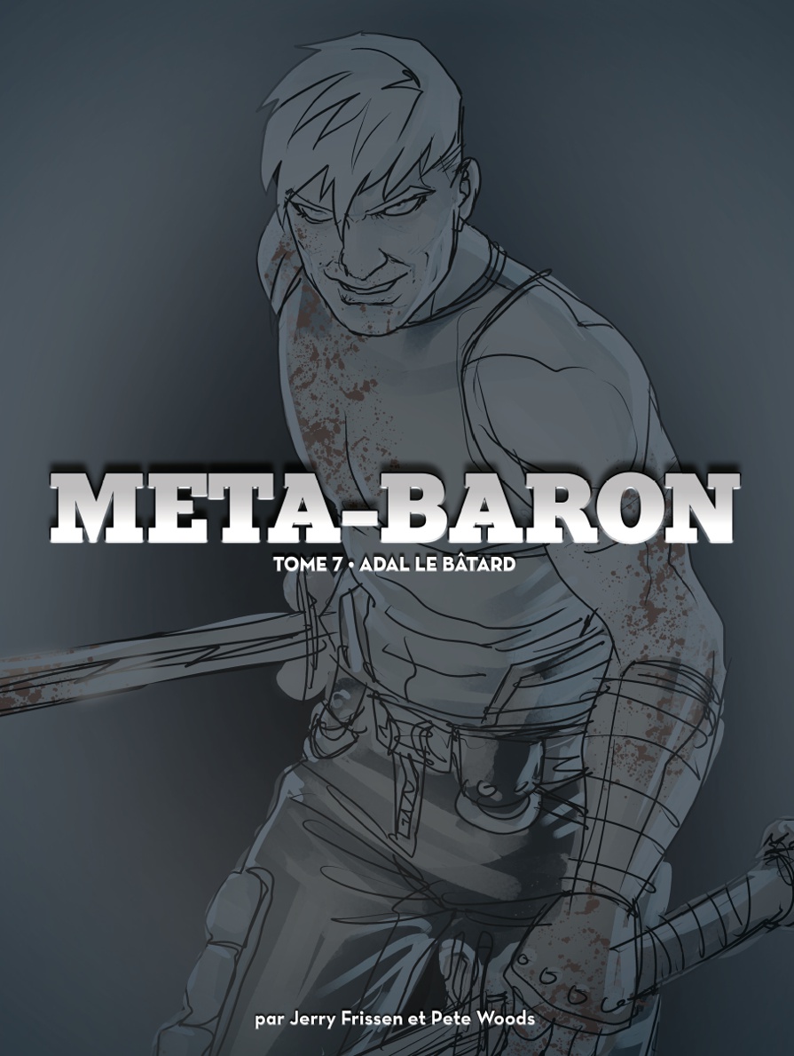
- Méta-Baron
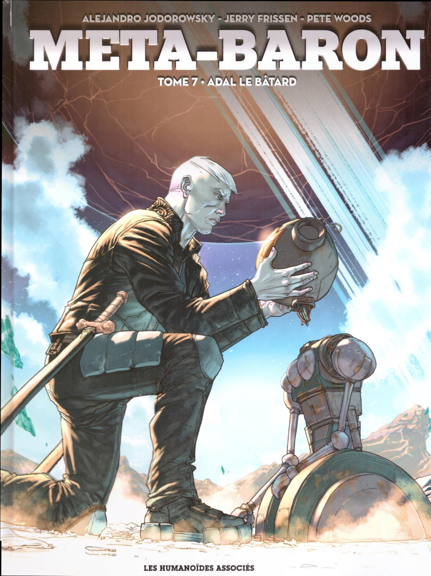
- Adal le Bâtard
- 7
- 2.79/5 (14 votes)
- Europe
- Science-fiction
- 446287
- Frissen, Jerry
- Woods, Pete
- Woods, Pete
- Jodorowsky, Alejandro
- 05/2022 (Parution le 18/05/2022)
- 04/2022
- non coté
- Les Humanoïdes Associés
- 4
- Grand format
- 978-2-7316-5060-0
- 54
- 01/04/2022 16:59:37 (maj 25/11/2024 20:21:36)
- Info édition : Noté "Première édition : 2022".
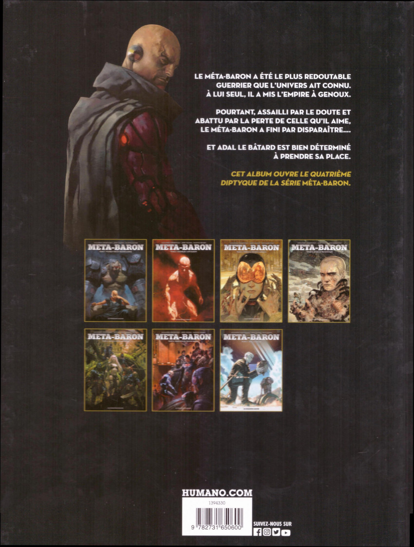
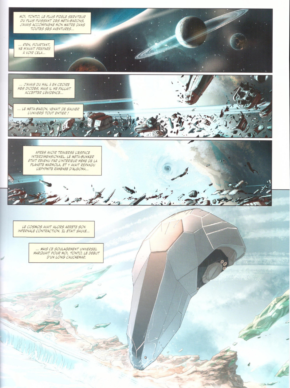
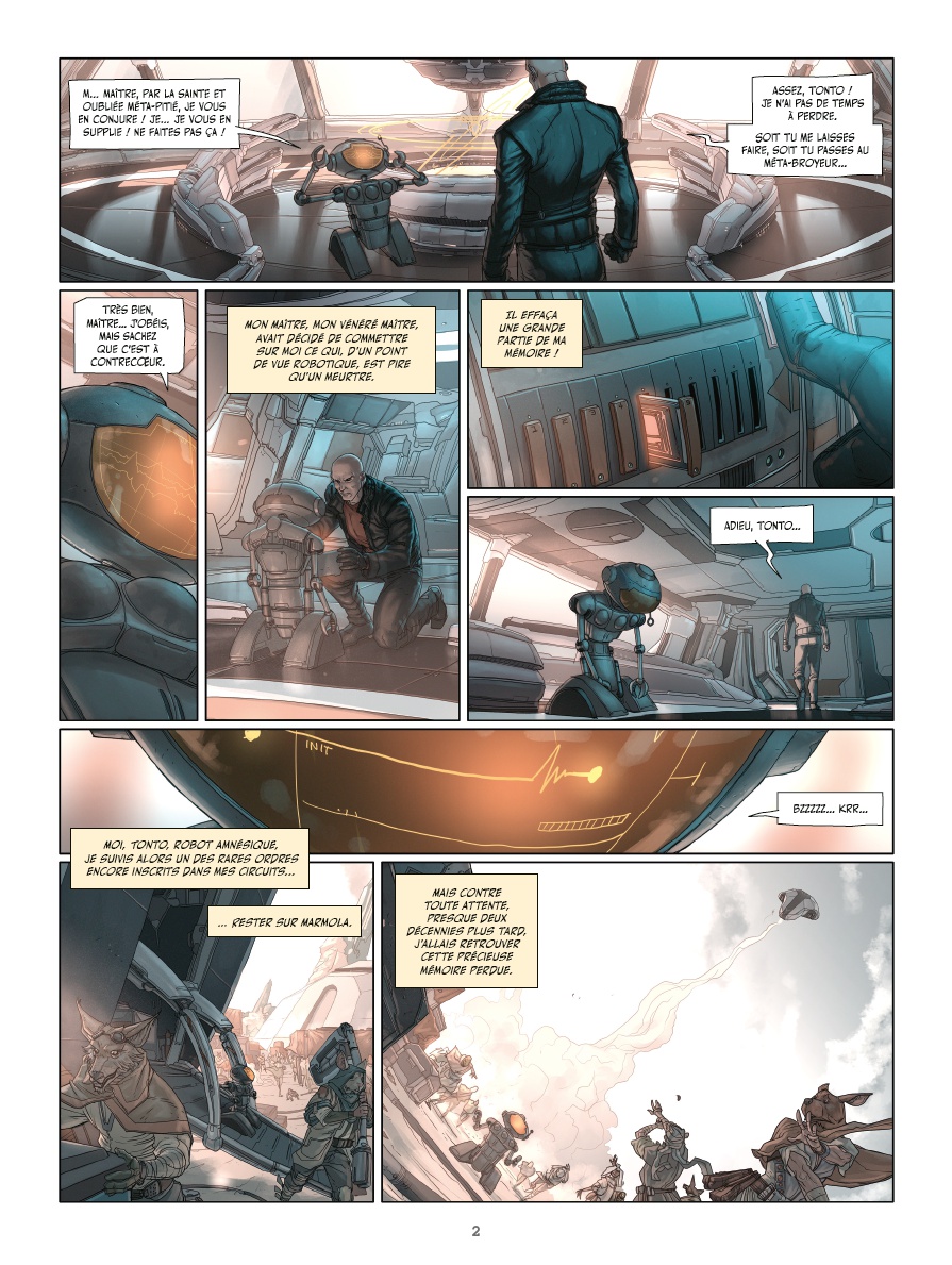
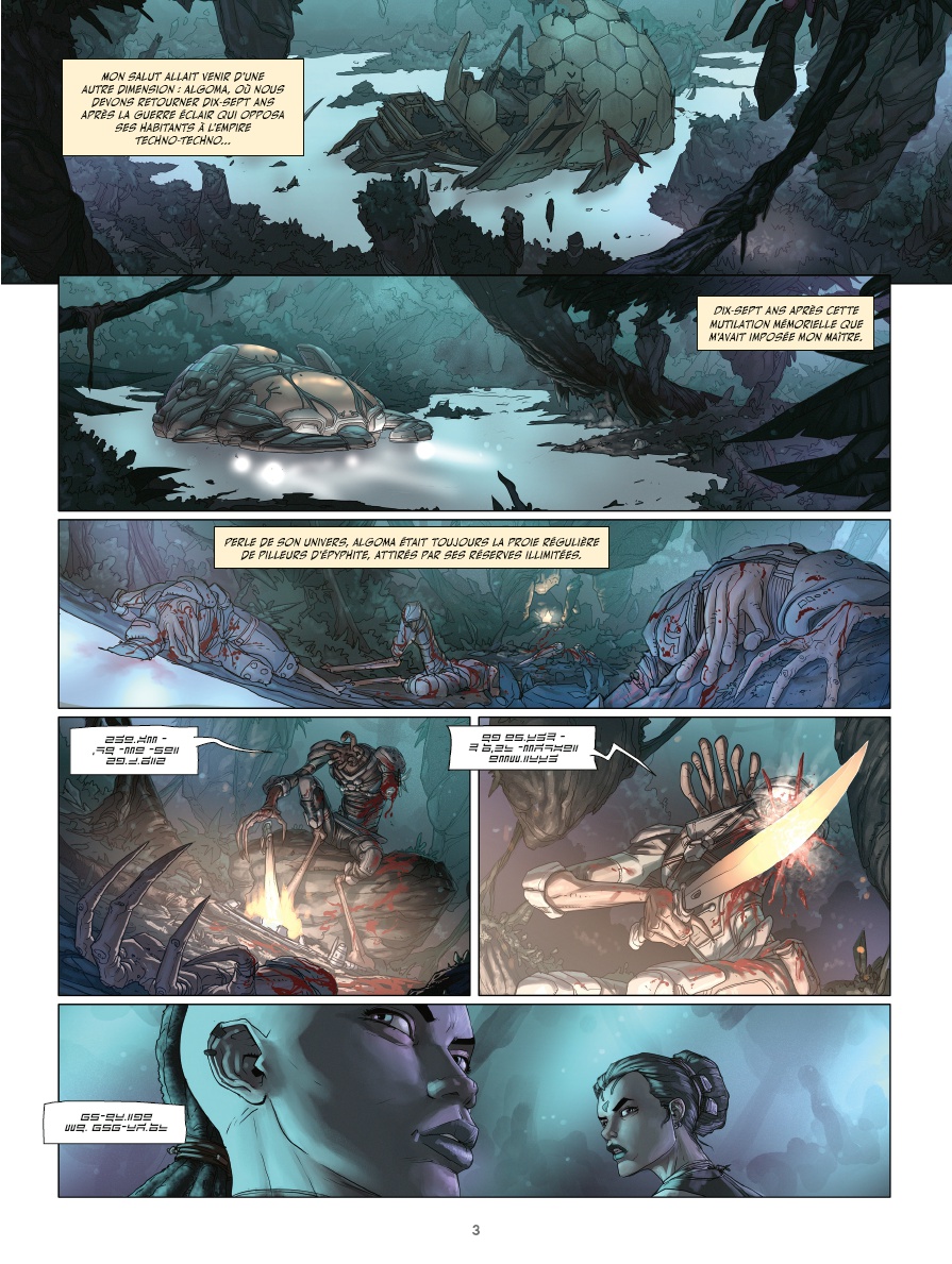
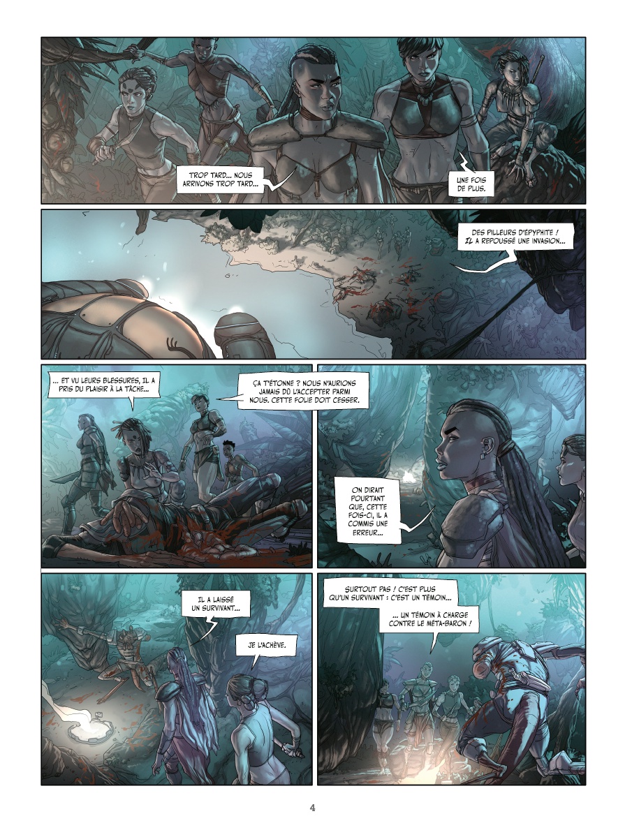
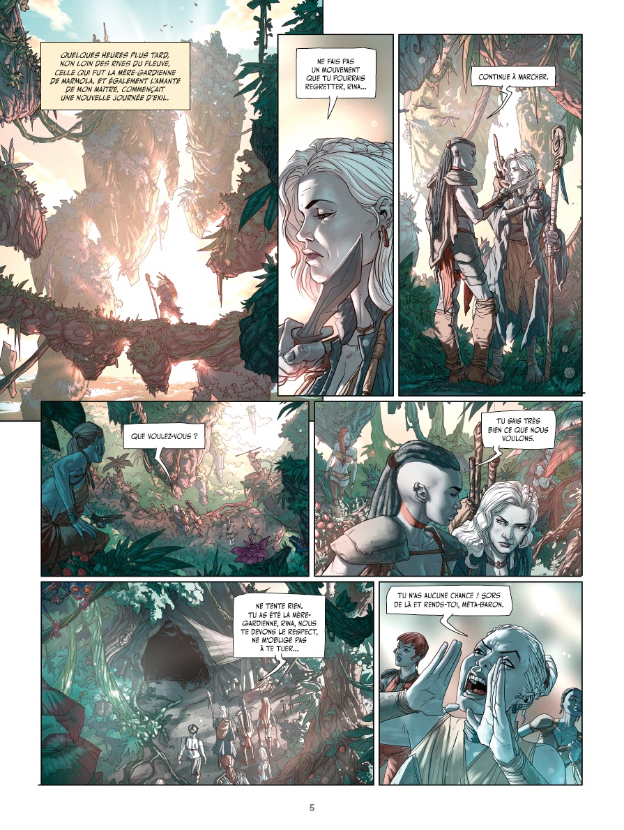
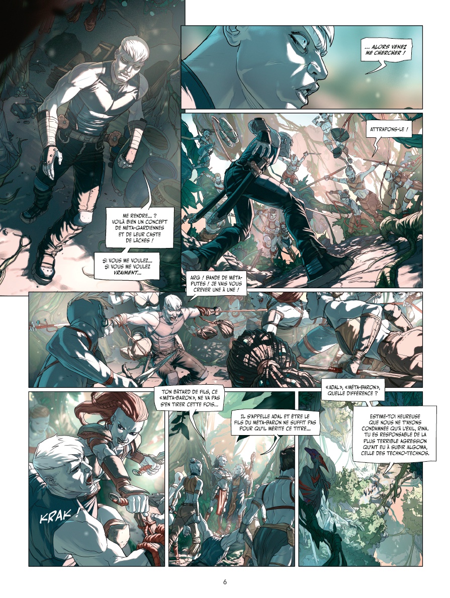
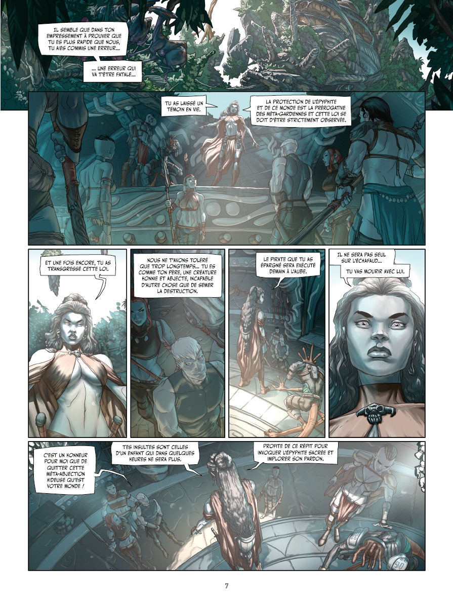
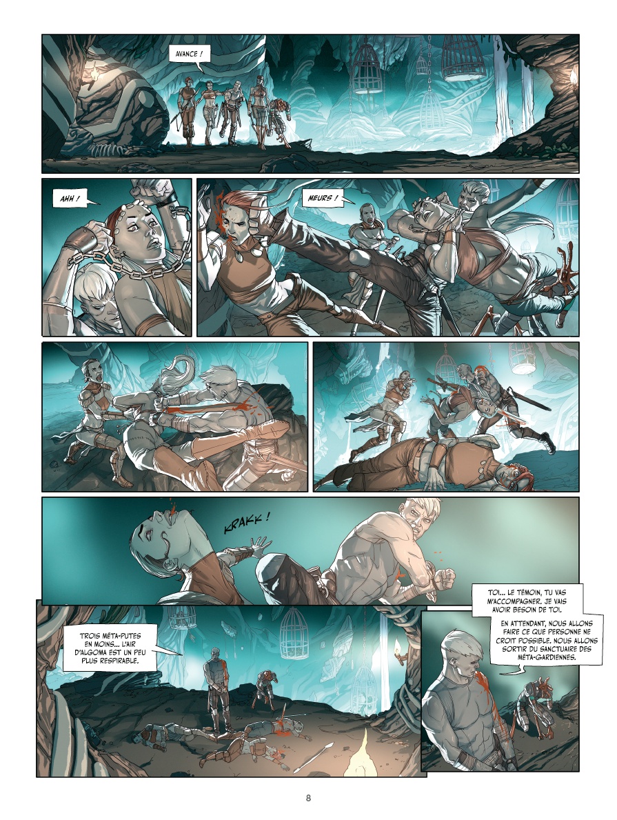
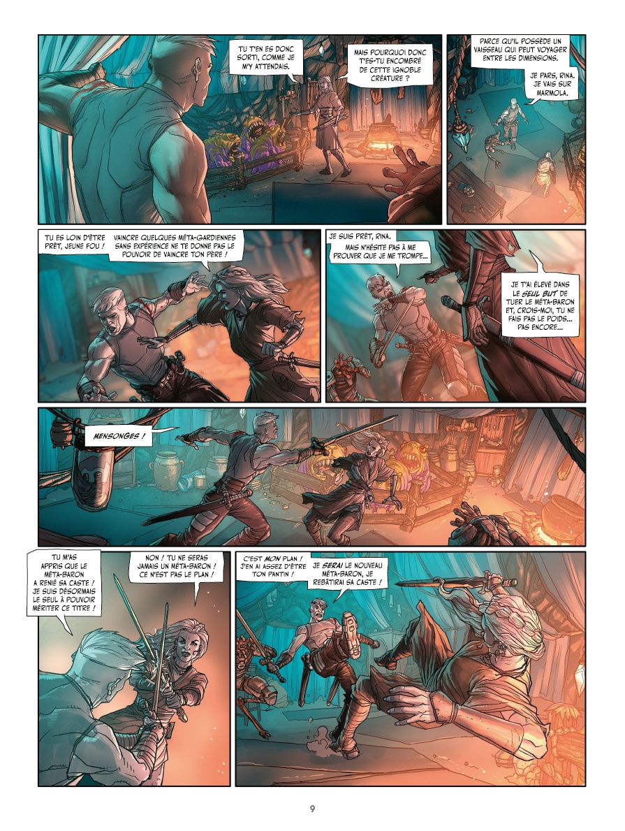
- Résumé: Contrôlant l'Épyphite, l'Empire Techno est plus puissant que jamais. Son ambition et sa cruauté s'étendent désormais à tout l'univers, mais il reste un obstacle : Le Méta-Baron. Le retour du plus grand guerrier de l'univers ! Depuis que le Méta-Baron a anéanti l'Empire, les Technos-Technos ont assis leur domination sur la galaxie. Tout bascule lorsque l'Épiphyte, le carburant des voyages interstellaires, vient à manquer : la planète natale du Méta-Baron est l'unique source d'épiphyte. Soudainement, les pires machines à tuer de l'univers se pressent aux portes du Méta-Bunker...
- La preview
-
- Les avis
-
Leo R
Le 21/11/2022 à 13:14:28
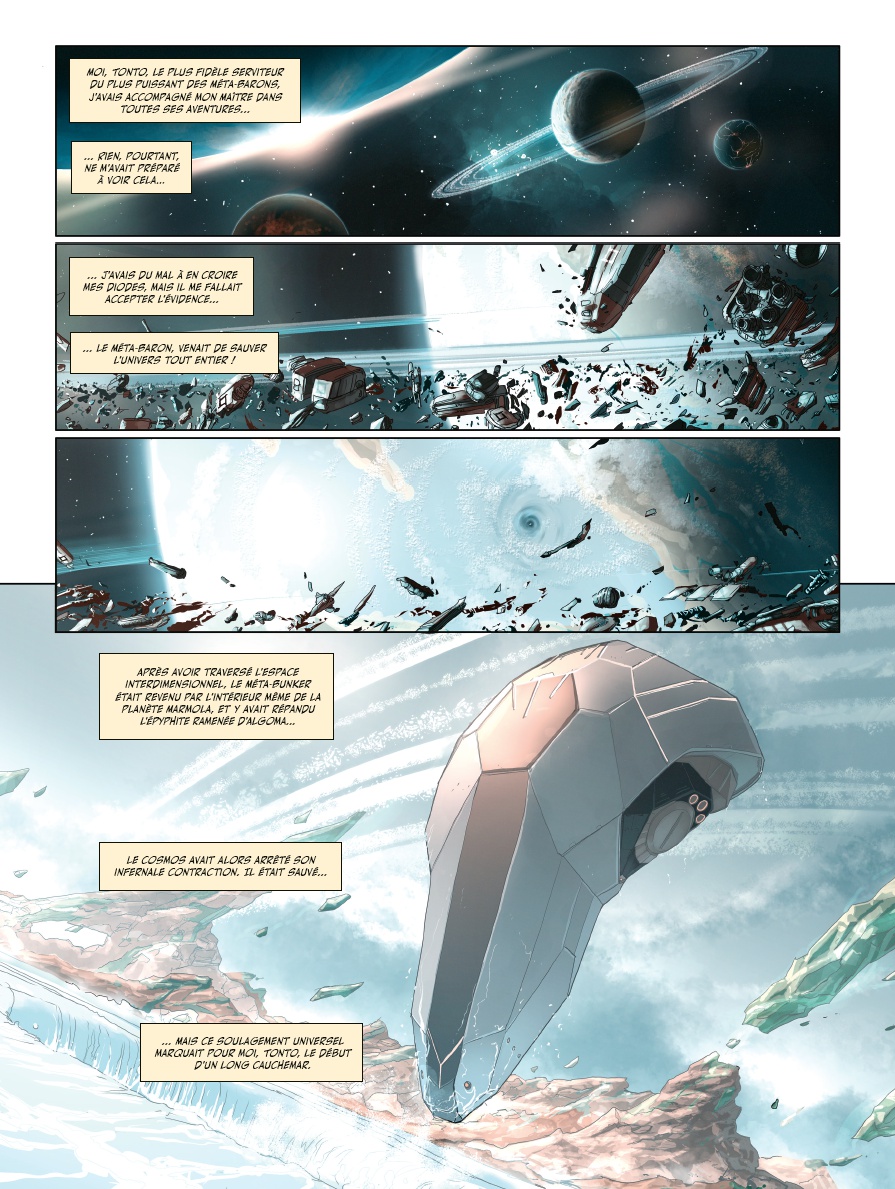
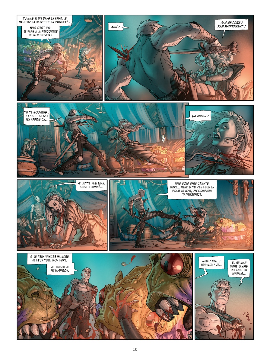
I didn't even think it would be that bad. Without even comparing it to the Metabarons of Gimenez or Kastaka, it's really bad. The visuals are very bad: the character designs and locations are very faded and unmemorable--just monstrous for a sci-fi comic. But even regardless of the design, the drawing style itself, the lines, the coloring, and the storyboard are very mediocre. The low detail and blurry backgrounds make it look like a very cheap American comic book that was hastily concocted in a couple of weeks. Sort of like the weekly Marvel or DC issues of Batman or the Avengers. A very low bar. The publisher had options for artists who had already established themselves in this universe: Sécher and Ladrönn. There are other just terrific artists who could have been brought in: Mukesh Singh, Esad Ribic, Jérémy, Travis Charest. Or great artists who have never worked with Jodoverse: Jaime Calderón or Riccardo Federici. After all, if they wanted something totally new, why not approach artists from the East? For example, Katsuya Terada or Sakamoto Shinichi - their Metabaron comics would have looked amazing in color. What were Les Humanoïdes Associés trying to accomplish? How could they trust their most important franchise to this? The sad demise of the series.
BDGest 2014 - Tous droits réservés
